Panel View Button

Add the Copilot button to the Panel view for easy access to the prompt dialog.

The Copilot view button can be added to any Panel view (site, page, file, user) alongside the default buttons like the preview button or settings dropdown. It opens a prompt dialog that allows you to generate content for a single or multiple fields at once.

Setting Up the View Button

To add the copilot button to a Panel view, set the buttons option in the corresponding blueprint:

buttons:
  - copilot # Re-order the button as needed
  - preview
  - languages

This way, you can reference the default buttons and decide where to place the copilot button. It will look something like this:

Copilot Panel view button

Using the View Button

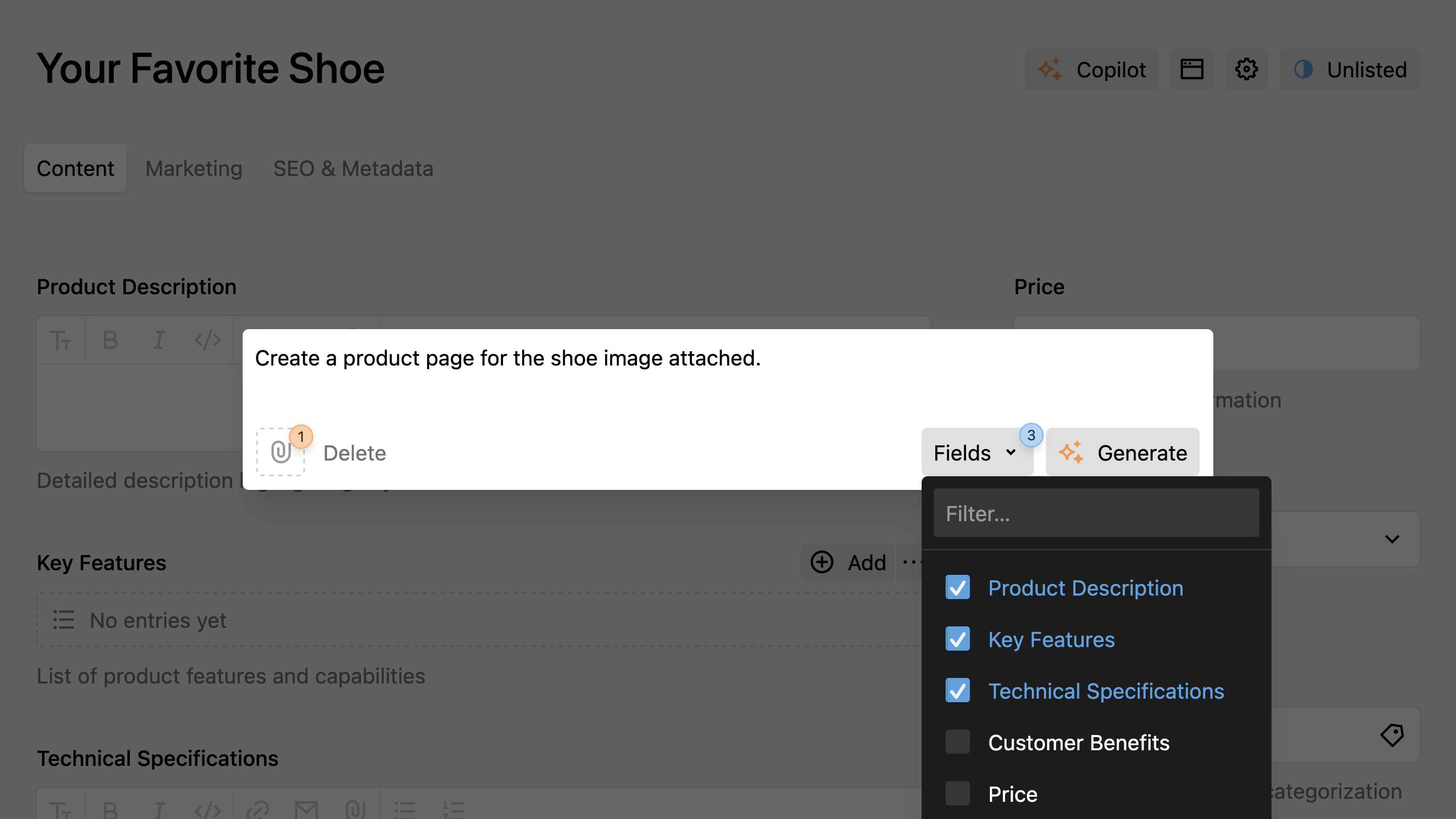
Clicking the button opens the Copilot prompt dialog. By default, no fields are selected – you need to select the fields you want to generate content for. This is especially useful for multi-field content generation.

Finally, enter your prompt and click the Generate button to start the content generation process.

See the Field Placeholders guide to learn how to reference other fields as context in your prompts.

Cancel Generation

To stop generation mid-stream:

  • Press Esc on your keyboard, or
  • Hover over the generate button and click the cancel icon.

Prompt History

Your prompts are saved in the browser's local storage (up to 50 entries per site). Navigate through history with the arrow keys when the prompt dialog is open.

See the Quick Reference for all keyboard shortcuts.

Button Configuration

The Copilot view button can be customized with various properties to control its behavior and appearance. You can configure the button using props in your blueprint or set global defaults in your config.php file.

Basic Configuration

Instead of just adding the button name, you can configure it with specific properties:

pages/default.yml
buttons:
  copilot:
    label: AI Assistant
    userPrompt: |
      Write a complete landing page for "{title}": a compelling headline, introduction, three benefit sections, and a call-to-action.
    theme: blue-icon
    logLevel: info
  preview: true
  settings: true
  languages: true
  status: true

Available Properties

The Copilot view button supports the following properties:

label
String
Custom label for the view button. The default depends on the Panel language.
userPrompt
String
Default user prompt that appears when the generation dialog opens. Users can edit the prompt before generating content.
systemPrompt
String
Custom system prompt that controls how the AI structures and formats the generated content. Users cannot see or edit this prompt.
theme
String
Controls the visual appearance and color theme of the button (e.g., blue-icon, positive, negative-icon).
logLevel
String
Set the logging level for debugging AI generation. Options: error, warn, info, debug.
For detailed information about all available configuration properties, see the Global Configuration and View Button & Section Configuration pages.

Configuration Inheritance

Button configurations follow a hierarchy where more specific settings override general ones:

  1. Global configuration (in config.php)
  2. Button props (in blueprint)

For example, if you set a global system prompt, individual buttons can override it:

config.php
return [
    'johannschopplich.copilot' => [
        'systemPrompt' => 'You are a professional content writer.',
        'theme' => 'blue-icon'
    ]
];
Blueprint Override
buttons:
  copilot:
    systemPrompt: You are a technical documentation expert. # Overrides global
    # theme: blue-icon inherited from global config